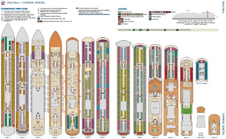
Since the announcement that Costa Venezia would be joining the Carnival fleet, we have been following all of the news articles and stories that come out about the ship. When they became available, I immediately downloaded the deck plans for the ship to my phone so we could identify the similarities and changes between the Costa ship against one of the ships that we’ve sailed on several times. We scoured the deck plans for hours and were so fascinated by the updates, that we recorded a video comparing the Carnival Venezia to the Carnival Panorama (here’s a link to that video if you haven’t seen it).
As we continue to get closer to the official launch of Carnival Venezia (which Mark will be sailing the inaugural from Barcelona!), we have scouted out spots on the ship we want to capture for those interested in this newest Carnival Cruise Line ship. Concurrently, we have been scrutinizing the deck plans for the next Costa ship to join the Carnival fleet, the Costa Firenze.
As we have compared the deck plans between Carnival Venezia and Carnival Firenze, we noticed several differences and surprises between the two ships. Mark had the newest Venezia deck plan pulled up and we noticed that our two versions were different (his was updated, mine was that original version I downloaded when the ship was announced)!
I outline several of the changes that we see between the refreshed deck plans of the Carnival Venezia. Share your thoughts below; are you surprised by any of the changes that took place between the two iterations of deck plan?
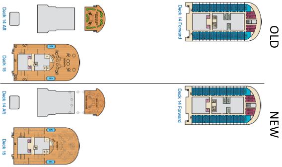
Deck 15 and Deck 14
Nothing major to note here. Carnival added in details to newer deck plan showing the placement of lounge chairs and added the ropes course pillars and layout.
Deck 12
On Deck 12, we see a lot of detail introduced into the design. This time, we see the Cloud 9 Spa and Fitness Center materialized into actual spaces. It looks like the spa services area has expanded into some of the grey space from the original deck plans! Moving further back, the new deck plans better define where Carnival Water Works sits, including slide drawings. The other major notable change is the size of the Warehouse: they’ve cut the extra part that jutted out in favor of more mini golf space. Finally, the Fitness space is a bit more defined on the new plans, showing the placement of fitness items aft of the ship.
Deck 11
On Deck 11, there’s no visible changes to the rooms. Stepping outside as we move aft, however, we see the addition of the Pergola bar on the Port side of the ship! This bar was not mentioned in the detailed kickoff of the ship, nor has it really been mentioned anywhere by Carnival! It makes sense to add a new venue here given how large this deck is. Plus, with the removal of BlueIguana Tequila Bar and Red Frog Rum Bar in favor of the singular Rococo Bar on Deck 10, adding back in another bar helps make up for the loss. Moving back inside as we go aft, we see the introduction of Dr. Suess Bookville added to Camp Ocean, and then the only other change is the addition of what appears to be a semi-round covering placed over the bar from Deck 10 at the very aft.
Deck 10
We don’t see any changes to the room configurations on Deck 10, though we’re still wondering why there are so many gaps at the front of the ship! Heading aft, outside, we see more definition for the Rococo Bar, JavaBlue Cafe, Tomodoro Mexitalian Fusion, and Guy’s Burger Joint. No new venues or spaces are introduced here, but we also see a more defined Lido space. Moving back through the Lido Marketplace, we again see more definition to the layout of seating. Moving outside, there’s not a lot of difference between the deck plans, aside from the stairs getting moved slightly further apart from each other (not sure why this was necessary as Deck 11 appears to have the stairs in the same placement).
Deck 9, 8, & 7
There weren’t any notable changes among these three decks. They are all room spaces with no changes in configurations.
Deck 6
Looking at the front of Deck 6, it’s very similar across the original and updated deck plans. It’s very odd to see no rooms at the front of the ship! Not sure what is in this space instead, but we plan to check it out on the inaugural. As we shift our attention to the very aft of the ship, we notice the introduction of a new interior-interior hallway that adds 2 rooms to the deck plan.
Deck 5
The forward section of Deck 5 includes more detail, however we don’t see many changes until we get to the middle of the ship, where we get to see how much space Amari Bar will consume! Additionally, we see the introduction of a new Fun Shops space just aft of the bar (appears to be a potential pinch point on both Venezia and Firenze). There’s also expanded restrooms and more details for the Frizzante Bar. The “Fun to be Revealed” section was announced on May 8th and we recorded a video about the Il Viaggio space. Moving further back, there’s a slight change to the layout of the restroom area in the Gondola Lounge and then some more definition for Terrazza. That rounds out deck 5.
Deck 4
The deck plans look much more full when we get down to these levels which requires a bit more review! When comparing Deck 4 across the old and new, we see the restrooms just outside of the main theater get swapped (weird), and the space that’s forward of the starboard-side Fun Shops is now grayed out. There’s also a new Fun Shops space on the port side of the main atrium. Just aft of the casino, the Venezia Casino Annex has more detail in the plans showing tables and slot machines, plus the addition of a Men’s restroom. From there, as we continue to head aft on the deck plan, the only notable changes are the seating in Limelight Lounge and tables in the Canal Grande Restaurant (Aft Main Dining Room).
Deck 3
There aren’t any notable changes to Deck 3, aside from the amount of detail included within the updated deck plans. Just a few extra partition walls are showing up in the Marco Polo Restaurant (Forward Main Dining Room) and seating in the Canal Grande Restaurant (Aft Main Dining Room).
Decks 2 and 1
On Deck 2, the only change we see is the addition of one stateroom on the very front of the ship on the Starboard side. Everything else about Deck 2 is identical.
Now when we look at Deck 1, we see the addition of 8 rooms all crammed into the forward part of the ship on the port side. It seems strange that they were able to magically add in these staterooms! We’ll be curious to learn more about this section of the ship and what allowed them to include this new space on the deck plans. Everything else on Deck 1 is the same as before.

Wrapping Up
We hope you enjoyed this in-depth review of the Carnival Venezia’s changes from when she was announced until present (at least as of May 12, 2023).
Head on over to our YouTube channel and join us as we head out on the Carnival Venezia inaugural sailing and be sure to subscribe so you don’t miss any upcoming content about the Carnival Venezia!


